Crank Brothers


Case Study
From garage start-up to global brand.
- Brand Strategy
- Brand Identity
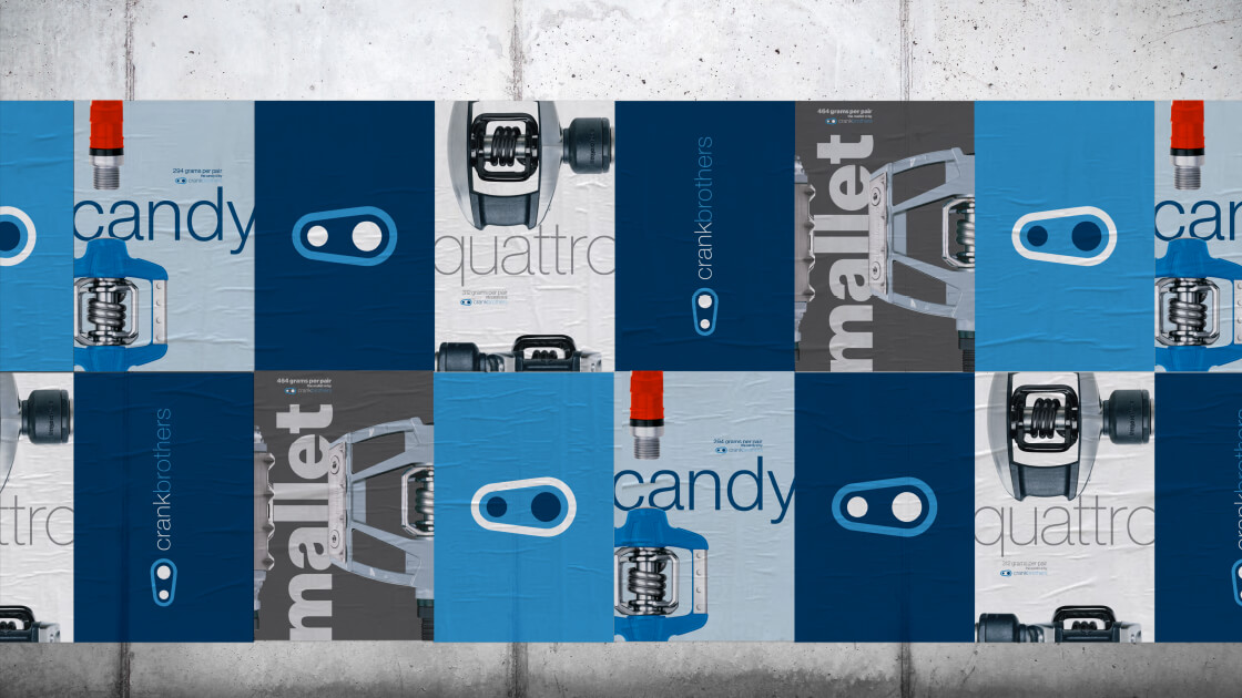
- Packaging System
- Naming
- Advertising
- Collateral
- Digital
- Product Graphics
- Retail
- Apparel
Overview
In 1997, Frank Hermansen and Carl Winefordner met while working at U.S. Diver. Becoming fast friends, they realized they shared a passion for mountain biking — and wouldn’t it be amazing if they could create products that would revolutionize the sport. Not long after, Crank Brothers was born.
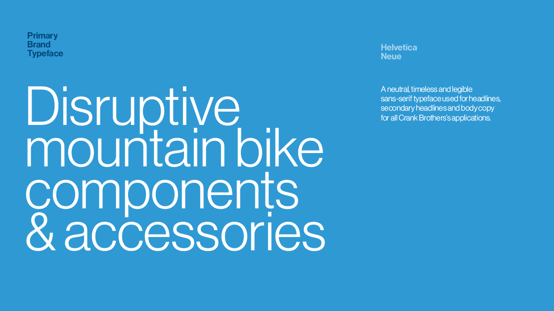
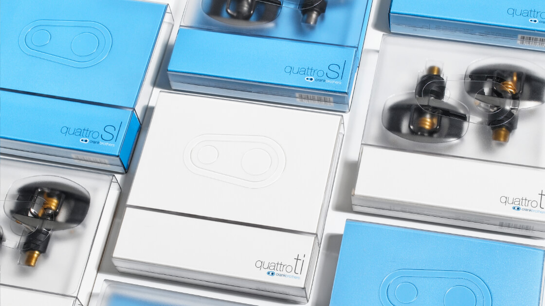
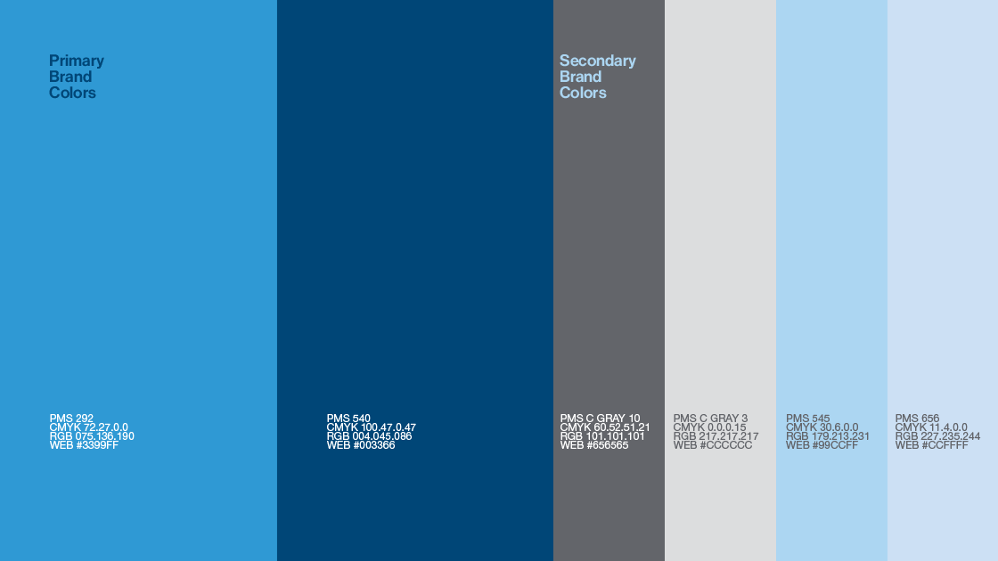
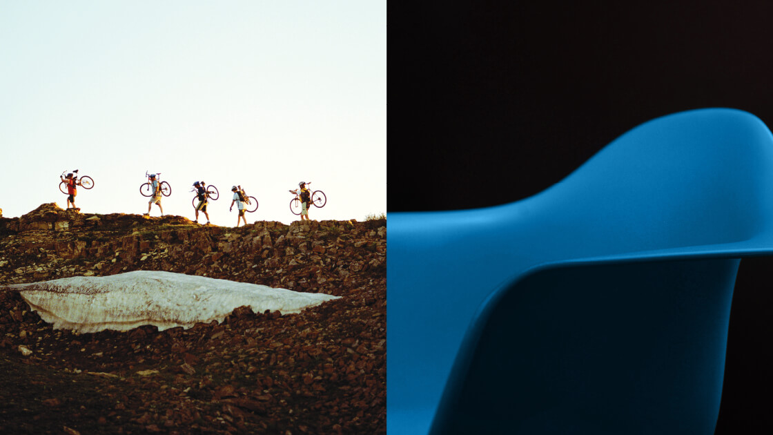
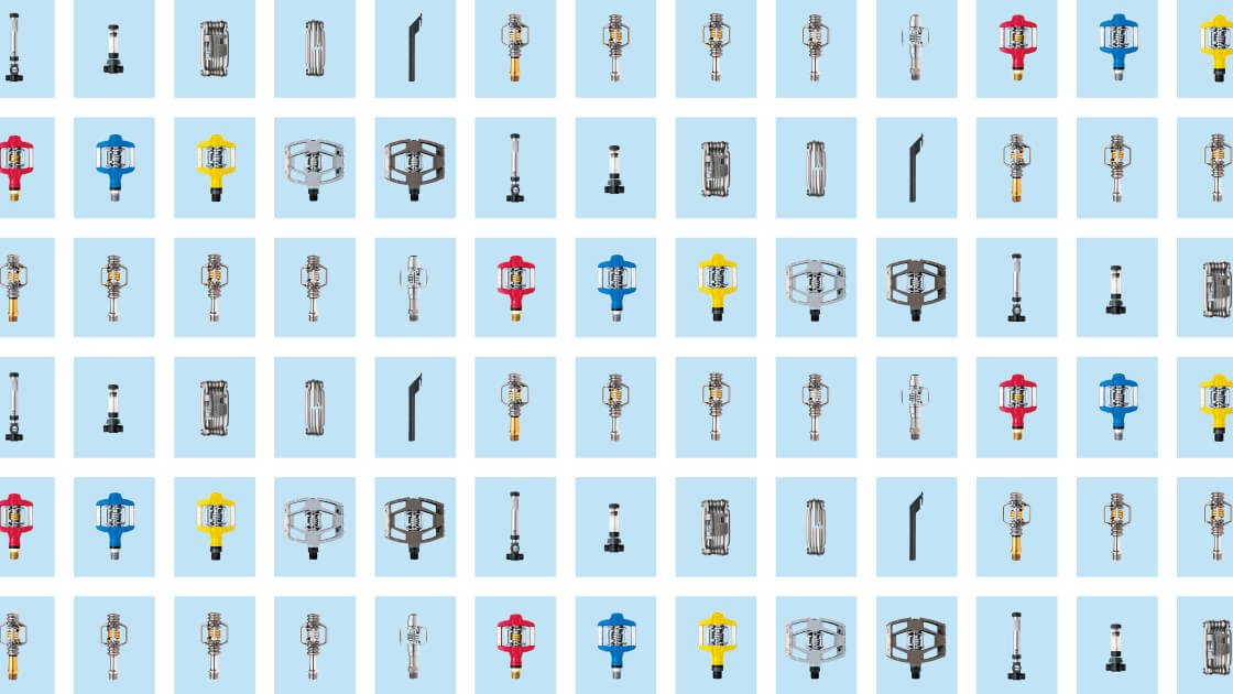
We created a logo that would be recognizable and stand out in a cluttered communications landscape. The simple, but impactful logo was a nod to the bike, without representing an exact component. Next, we created a complete visual system across key consumer touchpoints. Proprietary brand colors were chosen to set us apart from traditional bike colors. And our minimalist and bold visual approach focused on the beauty of the product versus the typical sponsored athlete. Today, Crank Brothers is an internationally recognized brand and leading bike components manufacturer. At the end of the day, we helped create a modern classic.